Don’t Judge Alone: A Wrinkle in Time

Well, it’s certainly been a while since I’ve done anything but a straight review, hasn’t it? It’s been far longer since I’ve even touched on covers. Which is sad, because I really do love looking at covers and trying to figure out why the design choices that were made happened.

I wanted to look at an older novel this time, because while you can go into everything from what themes in the novel the designer was pulling on to what they shifted to make the novel more marketable in a more recent work, there’s one thing you can’t see the development of in a book that’s been out for under ten years. The way public tastes have shifted over the years, and the way a novel’s cover has adapted to new trends can easily be seen in something that’s been around for several decades, though.

You’d think I’d have done this before, since noticing those shifts was one of the first things that got me looking at covers.  The oldest series I’ve looked at, though, has been Garth Nix’s Old Kingdom, and that only dates to the 90’s, with the only changes being very recent. It really doesn’t have the same feeling of generational shift that some other books do.

So let’s look at a novel that’s turning fifty-five this year, albeit with a few caveats. First, I’m only looking at A Wrinkle in Time, not the time quartet as a whole here. There really are an astounding amount of covers for this series, and all of us only want to be here so long.

Second, along a similar line, I really can’t hit every cover even this single book has ever had. I’m mostly going to be pulling out the ones that I’ve seen most often and the ones I find most interesting, though if I’ve missed a favorite of yours let me know.

And lastly, I’m going to try to break this up by era, but without access to individual books, it’s apparently impossible to get accurate dates on each design. I’m seeing covers I owned as a child listed with publication dates of 2016, and ones that I know I didn’t see until I was an adult listed under 1973. A lot of this is going to be guesswork and general “before my era/after my era.” Again, if I get anything glaringly wrong, let me know.

So, start from the oldest, I guess? Here are the three I’ve seen that I know are definitively before my time.

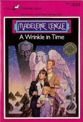
The first is the first edition from 1962, the second I would guess to be early 70’s between the art style and the $1.25 price point, and the last I think is probably late 70’s or early 80’s. It’s the copy of the book my older cousins had, at least, so that seems about the right time period. And even in this short span of time you can see how far tastes have already changed, as we go from “classic sci-fi” to “hippie flower child” to “prog rock van door.”

Looking back, I think the only one of these that I actually like is the first edition cover. It’s minimalist and timeless; it still looks like something that could be put on a shelf today without too much difference. In fact they pretty much did that for the 50th anniversary cover, and even then I like this original better. The new one has all of the characters standing straight and tall, which is nice but doesn’t fit; the body language on the silhouettes here screams confusion and distress, which is how the leads first react to travelling by tesseract.

It’s also the only one of the three that seems to fit the whole story for me. The sunshine and rainbows of the 70’s cover fits only a very small part of the story. And as much as the glowing red eyes of the 80’s cover intrigued me when I was six, I can’t say doom and gloom fits the entire novel either. And neither of them reflect that this story is far more sci-fi than fantasy. A group of children looking like they’ve just been shoved into something they’re not remotely ready for, while metaphorically teleporting is a pretty good description of the plot, though.

Not that the cover that is my era is much better than the latter two.

a wrinkle my book

Oh the 90’s pastels.

This one gets major nostalgia points from me, as it’s the copy I owned as a child (and still do!) When I think of Meg and Charles Wallace, those are the faces I see. Aesthetically, though, it probably ranks below even the flying rainbow cover. Given, I think it does a better job of capturing the tone of the story than most of the other ones. There’s peace and wonder here, but also a looming threat.

A lot of the newer covers do a good job of capturing that tone as well. All of these post-date me, so they’re all 2000 or later. And even just looking at the art style you can see how much times have changed. The bright colors and realistic style are gone, in favor of more muted tones and heavy stylization.

These are probably my three favorite of the ones that post-date me. Between personal experience and research I’d guess 2005-present on all of them, though I couldn’t find any details on the middle one.

The first is sketchy, whimsical, and manages to cover enough ground in its little details that it feel like it represents the book as a whole. The middle cityscape covers a lot less, but the Art Deco style is beautiful enough that it makes up for it for me. Besides, in spite of depicting what has to be Camazotz, it doesn’t have the overwhelming feeling of horror that the 80’s cover above does; the shining city could be either utopic or dystopic easily.

The standout for me is the last cover done by the Dillons, but when it comes to their artwork that’s almost always the case for me. The children look a little awkward, but the witches and landscape in the background are perfect. And while everything’s ominous, again it’s not so overwhelming that it makes the novel look like it’s horror.

I know these three also post-date me, though I can’t give an exact point for the first. The second says “40th anniversary” on it, so about 2002, and I remember seeing the third in bookstores in late high school, so around 2004. I like them less than the three above, but thought they were interesting enough to point out. Most of the other covers I hadn’t seen before seem to stick to some stripe of “Mrs. Whatsit in centaur form,” but these go a different route.

I admit I find the comet tails cover interesting largely because it doesn’t appear to depict anything described in the novel. I’m not sure what they were actually thinking with it, aside from “generic fantasy.” And if I had to guess a date for it, I’d probably peg it as early 2000’s, too; it has the same feel that a lot of generic covers from that era have. It almost looks like a Lurlene McDaniel cover to me.

The other two are much better, though, looking both modern and unique. The middle, rainbow circles cover, depicting what I’m assuming to be kything, is probably my favorite. It calls back to the first edition cover, plays off an underused mechanic from the novels, and references the science fiction in the story in a way most of the covers don’t. And again, it looks very modern to me; this is one of the only covers I’ve seen that uses a photo instead of a drawing.

The last I probably find more unique than appealing. The art style is not my favorite, but I find it almost biblical or iconographical in a way. Which fits: religion has always been a major part of L’Engle’s worlds, in a way that I’ve never really seen come through before. It feels older than the other two, but I think it has its place.

What I like about putting all of these together, though, is that you can clearly see the shift in taste that’s happened over A Wrinkle in Time’s long publication history. It’s harder with the newer ones for me, but the older ones I can glance at and say “god, that’s so 70’s” easily. And I think as we move on, that will happen for the 2000’s era covers, too. And with that cultural shift in taste comes the fact that everyone who’s ever read this book takes away a slightly different view of it. Or, for an older person, maybe they see their view of it represented better.

So, do you have a favorite, or one that you thinks best represents the novel? Or did I miss one of yours? The question of what cover art connects the most to people is always so subjective, so I’m always interested to know what other people like best, and why.

Don’t Judge Alone-Silver Phoenix/Kingdom of Xia

I think it’s time for some more cover analysis, don’t you?

This discussion may actually be a short one, because so far as I can tell there are a whole two US covers for this series, and even internationally I’m only finding one other variation. I still want to look at it, though. It’s one of the first works that pops to mind when I think “they shouldn’t have changed this cover, at least not in that way” and for good reason. There are multiple issues with the shift, from both the real world and industry politics that caused it.

Because most of the issue with the second cover set is political. The change was certainly controversial; the ire over it was how I found the series in the first place. Take a look at the two American variants available for the first book and you can probably see why.

Now, this is fantasy set in alt-world China. The shift from an explicitly Asian girl for the first variant to a girl who…probably isn’t but has enough of her face covered that there’s plausible deniability caused a stir, to say the least.

It didn’t help that this change was made around the time when The Last Airbender and Prince of Persia: Sands of Time came out, two movies that had their respectively Asian and Middle Eastern protagonists played by white actors. Or that all of these issues cropped up a year, at most, after Racefail had already blown open the racial fault lines in the Sci Fi and Fantasy genres. The change in the cover felt like just another hit in an already tense environment, and the controversy was wrapped up in the general anger over whitewashing that was coming to a head at the time.

This problem, the real world issue of representation, is really the most important reason they shouldn’t have changed this cover. But many other people have talked about that in more detail and far more eloquently than I could.

You’ll notice that the first link up there talks about how the author and publisher eventually released statements saying the reason for the change was that booksellers refused to take the novel on with the first variation. And that they thought it was worth it to have the story out there, even with a less than ideal cover.

And, generally, I agree. A character named Ai Ling is very obviously not white, in spite of a misleading cover, and that character is good to have among the overwhelmingly pale shelves of YA romance. Having the story out there regardless is important, even if the cover has some rather awful implications. I can get behind the idea that it’s a bad solution, but they might not have had a better one.

But then there’s the other problem.

There’s a part of me that still has a major issue with the second variant, even if it’s comparatively inconsequential. That thinks, quite simply, that it doesn’t fit the series.

I mean, yes, the YA romance aspect is there, but take the kissing out and the novel is a high fantasy quest set in basically ancient China. The first cover reflects this beautifully. Bright colors! Sweeping landscapes! Dramatic poses! Ancient clothing and buildings! Actual Asian model! Even if the people approving these things weren’t worried about the social implications of their work, you’d think they’d be concerned with appropriate design.

The second cover has the glowing, magical item to its name, but that’s about it. I mean, what else do you get off of these two?

Two girls on flat color backgrounds in modern clubbing clothes. Everything about this screams urban fantasy set in a modern world with a secret magical underground, down to the blurbs from Alyson Noel. Just looking at the covers I would expect something along the lines of Mortal Instruments or The Dresden Files. Even beyond the racial aspect these two designs are obviously attempting to paint the series as something that it’s not, because the only thing they get right are the two very broad categories of “magic” and “romance.”

They could have done better, all around.

I can’t even fully blame the publisher here, though, because the reason behind the bad fit is most likely also political, at least on the industry level. Urban fantasy was what was selling in 2009. The booksellers wanted something they were more likely to make a buck on. The publisher believed in the story and wanted to keep it in the public eye, so they packaged it as what was getting picked up.

They did what they needed to in order to keep the series alive, and I guess I can’t complain that much about it. Even if those covers very much belong on another book. Even if I very much wish they had managed to work the story they were actually selling in, on both fronts.

I was going to end this making the rather depressing point that cover design is often more about what sells well than about representing the book, and pleading for publishers to try to find some compromise between the two. While trying to find pictures, though, I spotted this one.

indonesiacover

This is the Indonesian cover, and I kind of love it. It strikes exactly the balance I was going to beg the publishing companies to find: stylish enough to appeal to teenage readers but with enough fantasy to actually give the idea of the series. If the artist has to play off of the “creepy demon” aspect of the books instead of the “high adventure” one to do that, so be it. At most I would criticize the lack of action in the design, but considering the circumstances, I’ll take it. It’s a good cover for the book. It’s nicely designed and it fits.

And both the character and the design are obviously Asian.

We can have the best of both worlds here; we just need to dig a little deeper for it.

Don’t Judge Alone-The Old Kingdom Series

Apparently when I get stuck with my writing, when I have a review that is almost there but just needs to percolate a little more, I default to ranting about covers.

Well, I default to ranting about stuff in general, but covers are the easiest. Anything else I might do, the overviews of older fantasy books, the character analyses, the looks at weird dollar store finds, all require at least as much planning and research as a normal review would. They’re no good for an on the fly “this isn’t working.”

Covers are mostly impressions, though, and that’s exactly their power. No research needed, just eyes.

Today my eyes are looking at the covers for Garth Nix’s Old Kingdom Series, consisting currently of an original trilogy from the late 90’s (Sabriel, Lirael, and Abhorsen), several short stories, and a fourth book from 2014, with a fifth coming out later this year. This is a piece of dark high fantasy, set in a world where wild magic and necromancers run amok, the structure of the controllable Charter magic used by humans is starting to fall apart, and a hero called the Abhorsen is tasked with defending the remnants of the Charter and setting the warlocks’ reanimated minions back to rest.

You can already start to see from that description where that might go. It’s heroic fantasy, which carries a certain aesthetic with it, it has darker elements, which carry another, and aside from both of those things, the novels build their symbology beautifully. From the magical language we’re given in the Charter marks, to the tools the necromancers use, to any of the other beautiful imagery Nix gives us, there’s plenty in there for a cover artist to work with.

And most of the covers use it well. This is kind of the opposite of The Modern Faerie Tales, the last series I talked about. Where those had three sets of covers that I liked well enough and one that I hated, this series has generally good cover sets with one that I absolutely love. The original covers are perfect and I still can’t say I know why they ever changed them.

We’ll get back to those, though. I want to save the best for last.

I also want to note that I’ll only be looking at the English-language covers, and only for the main series. Looking into it, I’m seeing a lot of foreign covers that I have neither the space nor inclination to talk about, so I’m sticking to the ones that are familiar to me: the two newer American covers, the new Australian ones, and the originals.

As for only doing the main series, there seem to be a lot of little variations among the short story and omnibus covers, but they’re all along the same lines as the four cover sets that I’m already doing. I figure it’s good pick out the most relevant with a series that has so many covers I couldn’t possibly talk about them all.

We’ll go with my personal worst to best, this time around.

The newer American editions come in two versions; these slightly older ones that show Charter marks aflame over a flat color, which apparently double as the UK editions.

And these which are the same idea, transposed over background images of our heroes striding across fantasy landscapes.

I have no dislike in my heart for either of these covers. They pull in one of the major aspects of the series’ worldbuilding, they’re decently eye-catching, and the background images on the set that use them are very pretty. The ones with the backgrounds even have this nice effect of smaller charter marks picked out in gloss all over the mostly matte cover.

But I’ve always thought they were a little boring, especially the ones that just use the flat color as the background. They look to me like nothing so much as those adult Harry Potter covers: made for people who are embarrassed to be reading fantasy because someone, somewhere decided that Real Books don’t have pictures on them.

The ones with the actual backgrounds are definitely better, but they still look sort of standard to me. I feel like I’d probably glance over them on the shelf if I didn’t already know the author.

The newer Australian covers are much better.

I actually really like these, and wish we’d gotten them here in the States. These just look like heroic fantasy to me, with the heroes in fighting poses, sending glowing beams out of their fingertips. I think a lot of people view this sort of thing as cheesy, but to me it’s always been a marker of a book I’d be interested in reading, with characters I want to read about.

These not only look like characters I want to read about, they also look like their book counterparts right down to their attitudes. Sabriel looks like she’ll destroy you, and finally gets her bob. Lirael looks suitably unsure. The glowy magic isn’t book accurate, but considering that most of the powers in the books are sound based, I think we can forgive the translation for a visual medium. The lines in the Abhorsen cover look like they’re supposed to be sound waves anyway. I appreciate the attention to detail as much as the beautiful artwork here.

But I’ll never stop mourning the original covers.

I put Across the Wall here too, largely for balance. This set never got a cover for Clariel.

Done by legendary husband and wife duo Leo and Diane Dillon, these are perfection to me. They’re stylistically unique, they’re creepy and dark, and they’re explicitly fantastical. Not only that, they pull in and showcase so many of the elements that make the series stand out: the Charter marks, the bells, the surcoats and their symbols, the magical accoutrements that Lirael finds.

I think what I love most about these is that they look a little like religious iconography, or something out of medieval manuscript. It suits a fantasy series that deals with the nature of life and death in the collapse of the world’s order perfectly. It even suits the direction the books eventually take, with our characters seeking to rebuild the Charter by becoming the new pillars in its foundation.

Nothing they could put out after was ever going to live up.

I said in my last cover post that all I really want out of a good cover is something pretty enough that suits the series, and I stand by that. All of these covers do that, and I do honestly like all of them. But there’s also that perfect sweet spot of combining what the books give with an artist’s own vision. That’s where you get something really special.

Anyone else have a preference, either for these or one of the international editions that I didn’t cover?

Don’t Judge Alone-Modern Faerie Tales

Next week we’ll be moving on from one of my favorite authors working in YA to…another of my favorite authors working in YA. It’s a shift, I know.

I’m still working up my review of The Darkest Part of the Forest, but while doing that I’ve also been thinking a lot about Tithe and its sequels, the first of Black’s books that I read.

Why? Well because, although it’s a completely different story, The Darkest Part of the Forest is apparently set in the same universe and contains a decent amount of easter eggs for people who have read both. There were a couple of times I had to pull out my long neglected set of the series to check some names and timelines. As I did, I remembered how pretty the covers on my set were, and how disappointing the current covers are in comparison.

Which is sad to me, because the covers were a major part of what made me give the series a chance in the first place. I mean, look at these:

You can see how much design work went into them, and they’re beautiful for it.

Sure, they’re a little more pastel than the tone of the series technically calls for, but don’t they just exude magic? They look Celtic and modern and wild all at the same times, and the font gives them just enough of a creepy touch to fit the story.

I think about covers a lot. About a million people have talked about how important they are to the success of a book as advertising. I like to think about the artistic process involved, though. It’s always interesting for me to see what struck someone about a story so strongly that they chose that as its visual representation. Everything from the imagery chosen, to the positioning of elements, to the color palette can be telling.

For example, comparing Tithe’s original paperback cover to the one on the first edition is interesting, because where they both work off of the magic element, the tiny bit of creepiness added by the font in the paperback is blown up into the main feeling of the hardback’s cover.

tithefirsted

The sketchy lines and disturbing figures bring out the darker parts of the story, more so than the druidic swirls of the paperbacks. It also gives a glimpse of the characters, where my copies focus on the more symbolic elements of what the novels are about. I like the iconography of wings (fairies), sword (knighthood), and crown (power struggle), but getting a glimpse into the madness of the fairy court is great too.

The new British covers focus on the characters, too, even if they downplay the magical side of the story for the modernist one.

These ones almost look like neon signs to me. You still get some of the wilderness imagery here, but it’s simplified into stencils and presented in electric colors. I’m not sure if some editor thought this side of the story would sell better, or if it’s just what the artist got out of it. Either way it’s interesting to see how each of the designers had a slightly different take on the same novels. More importantly, it’s good to see how well and clearly they got across their chosen focus.

Which is why it’s so disappointing that the covers currently on the shelves are these:

I call these the creepy cosplay covers, and I have no idea how they happened.

I mean, I sort of get where they’re trying to go. There’s a strong romance aspect to the stories that none of the previous covers have picked up on. But they’re so badly done. Tithe could be worse even if the photoshop does look a little awkward, but even the posing on the other two feels wrong. The friend who introduced me to the series does visual design, and when I showed her these she cringed and said they looked like student film posters. To paraphrase her thoughts on the Valiant cover: “Like, she’s an inexperienced actress who’s hamming it up, and he’s some guy’s roommate who they dragged out of bed because they needed a second person in the shot.”

You’d think if they were going to spend the money to redesign the covers, they’d do it right. These look so cheap it seems like they’d be more of a turnoff on the shelf than anything. Especially since all of the others are at least decently well designed and make good moves to reflect the story. I thinks that’s all I want from a cover: pretty enough to be eye catching and feels somewhat like the book it’s on.

What about you guys? Do you like to look at different variations and see how they relate to the narrative at hand? Do you have any strong preferences about them? Does it also bum you out when bad covers happen to good books?