Next week we’ll be moving on from one of my favorite authors working in YA to…another of my favorite authors working in YA. It’s a shift, I know.
I’m still working up my review of The Darkest Part of the Forest, but while doing that I’ve also been thinking a lot about Tithe and its sequels, the first of Black’s books that I read.
Why? Well because, although it’s a completely different story, The Darkest Part of the Forest is apparently set in the same universe and contains a decent amount of easter eggs for people who have read both. There were a couple of times I had to pull out my long neglected set of the series to check some names and timelines. As I did, I remembered how pretty the covers on my set were, and how disappointing the current covers are in comparison.
Which is sad to me, because the covers were a major part of what made me give the series a chance in the first place. I mean, look at these:


You can see how much design work went into them, and they’re beautiful for it.
Sure, they’re a little more pastel than the tone of the series technically calls for, but don’t they just exude magic? They look Celtic and modern and wild all at the same times, and the font gives them just enough of a creepy touch to fit the story.
I think about covers a lot. About a million people have talked about how important they are to the success of a book as advertising. I like to think about the artistic process involved, though. It’s always interesting for me to see what struck someone about a story so strongly that they chose that as its visual representation. Everything from the imagery chosen, to the positioning of elements, to the color palette can be telling.
For example, comparing Tithe’s original paperback cover to the one on the first edition is interesting, because where they both work off of the magic element, the tiny bit of creepiness added by the font in the paperback is blown up into the main feeling of the hardback’s cover.
The sketchy lines and disturbing figures bring out the darker parts of the story, more so than the druidic swirls of the paperbacks. It also gives a glimpse of the characters, where my copies focus on the more symbolic elements of what the novels are about. I like the iconography of wings (fairies), sword (knighthood), and crown (power struggle), but getting a glimpse into the madness of the fairy court is great too.
The new British covers focus on the characters, too, even if they downplay the magical side of the story for the modernist one.


These ones almost look like neon signs to me. You still get some of the wilderness imagery here, but it’s simplified into stencils and presented in electric colors. I’m not sure if some editor thought this side of the story would sell better, or if it’s just what the artist got out of it. Either way it’s interesting to see how each of the designers had a slightly different take on the same novels. More importantly, it’s good to see how well and clearly they got across their chosen focus.
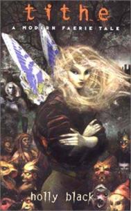
Which is why it’s so disappointing that the covers currently on the shelves are these:


I call these the creepy cosplay covers, and I have no idea how they happened.
I mean, I sort of get where they’re trying to go. There’s a strong romance aspect to the stories that none of the previous covers have picked up on. But they’re so badly done. Tithe could be worse even if the photoshop does look a little awkward, but even the posing on the other two feels wrong. The friend who introduced me to the series does visual design, and when I showed her these she cringed and said they looked like student film posters. To paraphrase her thoughts on the Valiant cover: “Like, she’s an inexperienced actress who’s hamming it up, and he’s some guy’s roommate who they dragged out of bed because they needed a second person in the shot.”
You’d think if they were going to spend the money to redesign the covers, they’d do it right. These look so cheap it seems like they’d be more of a turnoff on the shelf than anything. Especially since all of the others are at least decently well designed and make good moves to reflect the story. I thinks that’s all I want from a cover: pretty enough to be eye catching and feels somewhat like the book it’s on.
What about you guys? Do you like to look at different variations and see how they relate to the narrative at hand? Do you have any strong preferences about them? Does it also bum you out when bad covers happen to good books?